Kulturhuset Copenhagen
Graphic Design Studio | Branding & Visual Identity Assignment
DIS Copenhagen | Summer 2018
A“Kulturhuset” (community center), located along the harbor in Copenhagen. A place to learn & relax with family & friends.
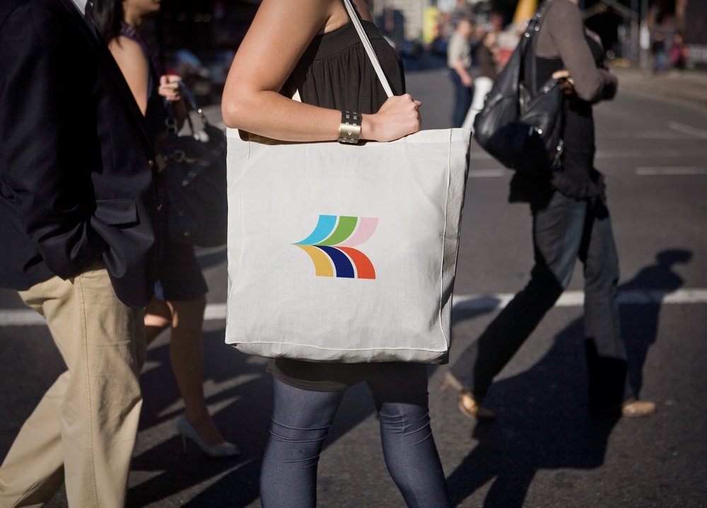
Rebrand for the culture house targeting people of 18-25 years. Millennials are socially connected, familiar with “the ripple effect” (one person has an experience, they share it, & it spreads). The ripple concept acted as the primary inspiration for the logo mark.
The color scheme is bright, bold, & lighthearted. Paired with a modern, sans-serif typeface, it appeals to a younger, trendier audience. The identity carries the vibrancy & connectedness of the millennial generation, as well as the energy of the culture house & co-creating.
Sketches
Mindmapping & visual explorations.


Overview
The design system for the Kulturhuset. I utilized the nickname for the culture house, “Bryggen,” as the new name & identity for the brand.

Detail View
A close-up look at pieces of the system—business cards, banners, posters, etc.